DataGrid Filter Row
Extension » DataGrid Filter Row
Include 'datagrid-filter.js' file
Enable Filter
Properties
The properties extend from datagrid, below is the added properties for datagrid.
| Name | Type | Description | Default |
|---|---|---|---|
| filterMenuIconCls | string | The icon class of filter menu item to indicate what item is used. | icon-ok |
| filterBtnIconCls | string | The icon class of filter button. | icon-filter |
| filterBtnPosition | string | The filter button position. Possible values are 'left' and 'right'. | right |
| filterPosition | string | The filter bar position accordion to columns. Possible values are 'top' and 'bottom'. | bottom |
| showFilterBar | boolean | True to display the filter bar. | true |
| remoteFilter | boolean | True to do remote filter. When enabled, the 'filterRules' parameter will be sent to remote server. The 'filterRules' parameter value is achieved by 'filterStringify' function. | false |
| clientPaging | boolean | True to do paging on the client side. | true |
| filterDelay | number | Delay to do filter from the last key input event in 'text' filter component. | 400 |
| filterRules | array | The definition of filter rules. Each rule contains 'field','op' and 'value' properties. | [] |
| filterMatchingType | string | Specify whether the filtered rows need to match ALL or ANY of the applied filters. Possible values are: 'all','any'. | all |
| filterIncludingChild | boolean | Determine if to include the child nodes when matching a node. | false |
| defaultFilterType | string | The default filter type. | text |
| defaultFilterTrigger | string | The event to trigger the filter action. | keydown |
| defaultFilterOperator | string | The default filter operator. | contains |
| defaultFilterOptions | object | The default filter options. | |
| filterStringify | function | The function to strinify the filter rules. |
function(data){
	return JSON.stringify(data);
}
|
| val | function | The function to retrieve the field value of a row to match the filter rule. |
function(row, field, formattedValue){
	return formattedValue || row[field];
}
|
Events
The events below extend from datagrid.
| Name | Parameter | Description |
|---|---|---|
| onClickMenu | item,button,field |
Fires when click the menu item, return false to cancel the filtering action. item: The clicked menu item. button: The filter button bound to the filter menu. field: The field name. |
Methods
The methods below extend from datagrid.
| Name | Parameter | Description |
|---|---|---|
| isFilterEnabled | none | true if the current filter is enabled and false if it is disabled. |
| enableFilter | filters |
Create and enable filter functionality.
The 'filters' parameter is an array of filter configuration.
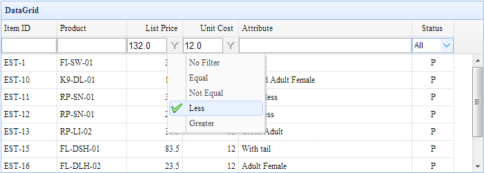
Each item contains following properties: 1) field: the custom rule on. 2) type: the filter type, possible values are: label,text,textarea,checkbox,numberbox,validatebox,datebox,combobox,combotree. 3) options: the options of the filter type. 4) op: the filter operation, possible values are: contains,equal,notequal,beginwith,endwith,less,lessorequal,greater,greaterorequal. Code examples
$('#dg').datagrid('enableFilter');
$('#dg').datagrid('enableFilter', [{
	field:'listprice',
	type:'numberbox',
	options:{precision:1},
	op:['equal','notequal','less','greater']
}]);
|
| disableFilter | none | Disable filter functionality. |
| destroyFilter | none | Destroy the filter bar. |
| getFilterRule | field | Get the filter rule. |
| addFilterRule | param |
Add a filter rule.
$('#dg').datagrid('addFilterRule', {
	field: 'desp',
	op: 'contains',
	value: 'easyui'
});
|
| removeFilterRule | field | Remove a filter rule. If the 'field' parameter is not specified, remove all the filter rules. |
| doFilter | none | Do the filter based on some filter rules. |
| getFilterComponent | field | Get the filter component on a specified field. |
| resizeFilter | field | Resize the filter component. |