DateBox
Extend from $.fn.combo.defaults. Override defaults with $.fn.datebox.defaults
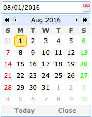
The datebox combines a editable text box with drop-down calendar panel that allows the user to select a date. The entered string in the text box can be transformed to a valid date. The selected date can also be formatted as expected.
Dependencies
- combo
- calendar
Usage Example
Create datebox from markup.
Create datebox using javascript.
Properties
The properties extend from combo, below is the added properties for datebox.
| Name | Type | Description | Default |
|---|---|---|---|
| panelWidth | number | The drop down calendar panel width. | 180 |
| panelHeight | number | The drop down calendar panel height. | auto |
| currentText | string | The text to display for the current day button. | Today |
| closeText | string | The text to display for the close button. | Close |
| okText | string | The text to display for the ok button, reserved for datetimebox plugin. | Ok |
| disabled | boolean | When true to disable the field. | false |
| buttons | array |
The buttons underneath the calendar. Available since version 1.3.5.
Code example:
var buttons = $.extend([], $.fn.datebox.defaults.buttons);
buttons.splice(1, 0, {
	text: 'MyBtn',
	handler: function(target){
		alert('click MyBtn');
	}
});
$('#dd').datebox({
	buttons: buttons
});
|
|
| sharedCalendar | string,selector |
The shared calendar used by multiple datebox components.
Available since version 1.3.5.
Code example: <input class="easyui-datebox" sharedCalendar="#sc"> <input class="easyui-datebox" sharedCalendar="#sc"> <div id="sc" class="easyui-calendar"></div> |
null |
| formatter | function |
A function to format the date, the function take a 'date' parameter and return a string value.
The example below shows how to override the default formatter function.
$.fn.datebox.defaults.formatter = function(date){
	var y = date.getFullYear();
	var m = date.getMonth()+1;
	var d = date.getDate();
	return m+'/'+d+'/'+y;
}
|
|
| parser | function |
A function to parse a date string, the function take a 'date' string and return a date value.
The example below shows how to override the default parser function.
$.fn.datebox.defaults.parser = function(s){
	var t = Date.parse(s);
	if (!isNaN(t)){
		return new Date(t);
	} else {
		return new Date();
	}
}
|
Events
| Name | Parameters | Description |
|---|---|---|
| onSelect | date |
Fires when user select a date.
Code example:
$('#dd').datebox({
	onSelect: function(date){
		alert(date.getFullYear()+":"+(date.getMonth()+1)+":"+date.getDate());
	}
});
|
Methods
The methods extend from combo, below is the overridden methods for datebox.
| Name | Parameter | Description |
|---|---|---|
| options | none | Return the options object. |
| calendar | none |
Get the calendar object.
The example below shows how to get the calendar object and then recreate it.
// get the calendar object
var c = $('#dd').datebox('calendar');
// set the first day of week to monday
c.calendar({
	firstDay: 1
});
|
| setValue | value |
Set the datebox value.
Code example:
$('#dd').datebox('setValue', '6/1/2012');	// set datebox value
var v = $('#dd').datebox('getValue');	// get datebox value
|
| cloneFrom | from |
Clone the datebox from a source datebox. Available since version 1.4.1.
Code example:
<input id="from" class="easyui-datebox">

// Clone the datebox components from an existing datebox
$('.dt').datebox('cloneFrom', '#from');
|