EasyUI
Layout
Override defaults with $.fn.layout.defaults.
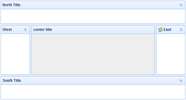
The layout is the container that has up to five regions: north, south, east, west and center. The center region panel is required but edge region panel is optional. Every edge region panel can be resized by dragging its border, they also can be collapsed by clicking on its collapsing trigger. The layout can be nested, thus users can build what complex layout he wants.

Dependencies
- panel
- resizable
Usage Example
Create Layout
1. Create Layout via markup.
Add 'easyui-layout' class to <div/> markup.
2. Create layout on whole page.
3. Create nested layout.
Notice that the west panel of inner layout is collapsed.
4. Loading content with ajax
The layout is created based on panel. Each region panel provides built-in support for asynchronously loading content from URLs. Using the async loading technology, users can make their layout page display more faster.
Collpase Layout Panel
Add west region panel with tool buttons
Layout Options
| Name | Type | Description | Default |
|---|---|---|---|
| fit | boolean | Set to true to set the layout size fit its parent container. When creating layout on 'body' tag, it will be auto maximized to the full size of whole page. | false |
Events
| Name | Parameters | Description |
|---|---|---|
| onCollapse | region | Fires when collapse a region panel. Available since version 1.4.4. |
| onExpand | region | Fires when expand a region panel. Available since version 1.4.4. |
| onAdd | region | Fires when add a new region panel. Available since version 1.4.4. |
| onRemove | region | Fires when remove a region panel. Available since version 1.4.4. |
Region Panel Options
The region panel options is defined in panel component, below is some common and added properties:
| Name | Type | Description | Default |
|---|---|---|---|
| title | string | The layout panel title text. | null |
| region | string | Defines the layout panel position, the value is one of following: north, south, east, west, center. | |
| border | boolean | True to show layout panel border. | true |
| split | boolean | True to show a split bar which user can change the panel size. | false |
| iconCls | string | An icon CSS class to show a icon on panel header. | null |
| href | string | An URL to load data from remote server. | null |
| collapsible | boolean | Defines if to show collapsible button. | true |
| minWidth | number | The minimum panel width. | 10 |
| minHeight | number | The minimum panel height. | 10 |
| maxWidth | number | The maximum panel width. | 10000 |
| maxHeight | number | The maximum panel height. | 10000 |
| expandMode | string |
The expanding mode when click on the collapsed panel. Possible values are 'float','dock' and null. float: the region panel will expand and float on the top. dock: the region panel will expand and dock on the layout. null: nothing happens. Available since version 1.4.4. |
float |
| collapsedSize | number | The collapsed panel size. Available since version 1.4.4. | 28 |
| hideExpandTool | boolean | True to hide the expand tool on the collapsed panel. Available since version 1.4.4. | false |
| hideCollapsedContent | boolean | True to hide the title bar on the collapsed panel. Available since version 1.4.4. | true |
| collapsedContent | string,function(title) |
The title content to display on the collapsed panel, possible values: 1) the title string. 2) a function that returns the title content. Available since version 1.4.4. Usage example:
collapsedContent: function(title){
	var region = $(this).panel('options').region;
	if (region == 'north' || region == 'south'){
		return title;
	} else {
		return '<div class="mytitle">'+title+'</div>';
	}
}
|
Methods
| Name | Parameter | Description |
|---|---|---|
| resize | param |
Set the layout size. The 'param' object has following properties: width: the layout width. height: the layout height. Code example:
$('#cc').layout('resize', {
	width:'80%',
	height:300
})
|
| panel | region | Return the specified panel, the 'region' parameter possible values:'north','south','east','west','center'. |
| collapse | region | Collapse the specified panel, the 'region' parameter possible values:'north','south','east','west'. |
| expand | region | Expand the specified panel, the 'region' parameter possible values:'north','south','east','west'. |
| add | options | Add a specified panel, the options parameter is a config object, see tab panel properties for more details. |
| remove | region | Remove the specified panel, the 'region' parameter possible values:'north','south','east','west'. |
| split | region | Split the region panel. Available since version 1.4.2. |
| unsplit | region | Unsplit the region panel. Available since version 1.4.2. |
| stopCollapsing | none | Stop collapsing the region panel. Available since version 1.9.11. |
