Panel
Override defaults with $.fn.panel.defaults.
The panel is used as a container for other contents. It is the base component for building other components such as layout, tabs, accordion, etc. It also provides built-in collapsible, closable, maximizable and minimizable behavior and other customized behavior. Panels can be easily embedded into any position of web page.
Usage Example
Create Panel
1. Create Panel via markup
Creation from markup is even easier. Add 'easyui-panel' class to <div/> markup.
2. Create Panel programatically
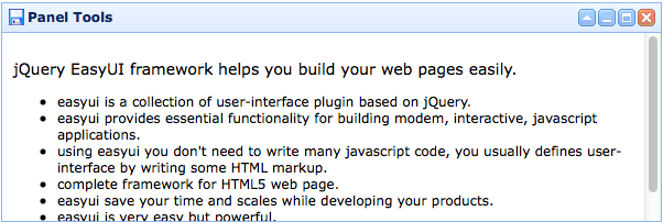
Let's create panel with tools on top right.
Move Panel
Call 'move' method to move panel to a new position
Load Content
Let's load the panel content via ajax and show some message when loaded successfully.
Properties
| Name | Type | Description | Default |
|---|---|---|---|
| id | string | The id attribute of this panel. | null |
| title | string | The title text to display in panel header. | null |
| iconCls | string | A CSS class to display a 16x16 icon in panel. | null |
| width | number | Set the panel width. | auto |
| height | number | Set the panel height. | auto |
| left | number | Set the panel left position. | null |
| top | number | Set the panel top position. | null |
| cls | string | Add a CSS class to the panel. | null |
| headerCls | string | Add a CSS class to the panel header. | null |
| bodyCls | string | Add a CSS class to the panel body. | null |
| style | object |
Add a custom specification style to the panel.
Code example to change the panel border width:
<div class="easyui-panel" style="width:200px;height:100px"
		data-options="style:{borderWidth:2}">
</div>
|
{} |
| fit | boolean |
When true to set the panel size fit it's parent container.
The example below shows a panel which can be auto resized to max inner dimensions of its parent container
<div style="width:200px;height:100px;padding:5px"> <div class="easyui-panel" style="width:200px;height:100px" data-options="fit:true,border:false"> Embedded Panel </div> </div> |
false |
| border | boolean | Defines if to show panel border. | true |
| doSize | boolean | If set to true,the panel will be resize and do layout when created. | true |
| noheader | boolean | If set to true, the panel header will not be created. | false |
| content | string | The panel body content. | null |
| halign | string | The panel header alignment. Possible values are: 'top','left','right'. Available since version 1.5.2. | top |
| titleDirection | string | The header title direction. Possible values are: 'up','down'. This property is valid only when the 'halign' property is set to 'left' or 'right'. Available since version 1.5.2. | down |
| collapsible | boolean | Defines if to show collapsible button. | false |
| minimizable | boolean | Defines if to show minimizable button. | false |
| maximizable | boolean | Defines if to show maximizable button. | false |
| closable | boolean | Defines if to show closable button. | false |
| tools | array,selector |
Custom tools, possible values: 1) an array, each element contains iconCls and handler properties. 2) a selector that indicating the tools The panel tools can be declared with exists <div> tag:
<div class="easyui-panel" style="width:300px;height:200px"
		title="My Panel" data-options="iconCls:'icon-ok',tools:'#tt'">
</div>
<div id="tt">
	<a href="#" class="icon-add" onclick="javascript:alert('add')"></a>
	<a href="#" class="icon-edit" onclick="javascript:alert('edit')"></a>
</div>
The panel tools can also be defined via array:
<div class="easyui-panel" style="width:300px;height:200px"
		title="My Panel" data-options="iconCls:'icon-ok',tools:[
				{
					iconCls:'icon-add',
					handler:function(){alert('add')}
				},{
					iconCls:'icon-edit',
					handler:function(){alert('edit')}
				}]">
</div>
|
[] |
| header | selector |
The panel header. Available since version 1.4.2.
Code example: <div class="easyui-panel" style="width:300px;height:200px" title="My Panel"> <header>Panel Header</header> </div> |
null |
| footer | selector |
The panel footer. Available since version 1.4.1.
Code example: <div class="easyui-panel" style="width:300px;height:200px" title="My Panel" data-options="footer:'#ft'"> </div> <div id="ft">Footer Content</div> |
null |
| openAnimation | string |
The opening animation. Available since version 1.4.1. Available values are: 'slide','fade','show'. |
|
| openDuration | number | The opening duration. Available since version 1.4.1. | 400 |
| closeAnimation | string |
The closing animation. Available since version 1.4.1. Available values are: 'slide','fade','hide'. |
|
| closeDuration | number | The closing duration. Available since version 1.4.1. | 400 |
| collapsed | boolean | Defines if the panel is collapsed at initialization. | false |
| minimized | boolean | Defines if the panel is minimized at initialization. | false |
| maximized | boolean | Defines if the panel is maximized at initialization. | false |
| closed | boolean | Defines if the panel is closed at initialization. | false |
| href | string |
A URL to load remote data and then display in the panel.
Notice that the content will not be loaded until the panel is open and expand.
This is useful to create a lazy loading panel:
<div id="pp" class="easyui-panel" style="width:300px;height:200px"
		data-options="href:'get_content.php',closed:true">
</div>
<a href="#" onclick="javascript:$('#pp').panel('open')">Open</a>
|
null |
| cache | boolean | True to cache the panel content that loaded from href. | true |
| loadingMessage | string | When loading remote data show a message in the panel. | Loading… |
| extractor | function |
Defines how to extract the content from ajax response, return extracted data.
extractor: function(data){
	var pattern = /<body[^>]*>((.|[\n\r])*)<\/body>/im;
	var matches = pattern.exec(data);
	if (matches){
		return matches[1];	// only extract body content
	} else {
		return data;
	}
}
|
|
| method | string | The http method to load content page. Available since version 1.3.6. | get |
| queryParams | object | The additional parameters that will be sent when loading a content page. Available since version 1.3.6. | {} |
| loader | function |
Defines how to load content page from remote server. Available since version 1.3.6.
This function takes following parameters: param: the parameter object to pass to remote server. success(data): the callback function that will be called when retrieve data successfully. error(): the callback function that will be called when failed to retrieve data. |
Events
| Name | Parameters | Description |
|---|---|---|
| onBeforeLoad | param | Fires before loading a content page, return false to ignore this action. Available since version 1.3.6. |
| onLoad | none | Fires when remote data is loaded. |
| onLoadError | none | Fires when some errors occur to load content page. Available since version 1.3.6. |
| onBeforeOpen | none | Fires before panel is opened, return false to stop the open. |
| onOpen | none | Fires after panel is opened. |
| onBeforeClose | none |
Fires before panel is closed, return false to cancel the close.
The panel declared below cannot be closed.
<div class="easyui-panel" style="width:300px;height:200px;"
		title="My Panel" data-options="onBeforeClose:function(){return false}">
	The panel cannot be closed.
</div>
|
| onClose | none | Fires after panel is closed. |
| onBeforeDestroy | none | Fires before panel is destroyed, return false to cancel the destroy. |
| onDestroy | none | Fires after panel is destroyed. |
| onBeforeCollapse | none | Fires before panel is collapsed, return false to stop the collapse. |
| onCollapse | none | Fires after panel is collpased. |
| onBeforeExpand | none | Fires before panel is expanded, return false to stop the expand. |
| onExpand | none | Fires after panel is expanded. |
| onResize | width, height | Fires after panel is resized. width: the new outer width height: the new outer height |
| onMove | left,top | Fires after panel is moved. left: the new left postion top: the new top position |
| onMaximize | none | Fires after the window has been maximized. |
| onRestore | none | Fires after the window has been restored to its original size. |
| onMinimize | none | Fires after the window has been minimized. |
Methods
| Name | Parameter | Description |
|---|---|---|
| options | none | Return options property. |
| panel | none | Return the outer panel object. |
| header | none | Return the panel header object. |
| footer | none | Return the panel footer object. Available since version 1.4.1. |
| body | none | Return the panel body object. |
| setTitle | title | Set the title text of header. |
| open | forceOpen | When forceOpen parameter set to true, the panel is opened bypass the onBeforeOpen callback. |
| close | forceClose | When forceClose parameter set to true, the panel is closed bypass the onBeforeClose callback. |
| destroy | forceDestroy | When forceDestroy parameter set to true, the panel is destroyed bypass the onBeforeDestroy callback. |
| clear | none | Clear the panel content. Available since version 1.4. |
| refresh | href |
Refresh the panel to load remote data.
If the 'href' parameter is assigned, it will override the old 'href' property.
Code example:
// open a panel and then refresh its contents.
$('#pp').panel('open').panel('refresh');
// refresh contents with a new URL.
$('#pp').panel('open').panel('refresh','new_content.php');
|
| resize | options | Set panel size and do layout. The options object contains following properties: width: the new panel width height: the new panel height left: the new panel left position top: the new panel top position Code example:
$('#pp').panel('resize',{
	width: 600,
	height: 400
});
|
| doLayout | none | Set the sizes of child components within the panel. Available since version 1.4. |
| move | options | Move the panel to a new position. The options object contains following properties: left: the new panel left position top: the new panel top position |
| maximize | none | Fits the panel winthin its container. |
| minimize | none | Minimizing the panel. |
| restore | none | Restores the maximized panel back to its original size and position. |
| collapse | animate | Collapses the panel body. The 'animate' parameter value indicates if to use animation effect. |
| expand | animate | Expand the panel body. The 'animate' parameter value indicates if to use animation effect. |