Slider
Override defaults with $.fn.slider.defaults.
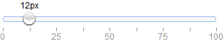
The slider enables the user to choose a numeric value from a finite range. When moving the thumb control along the track, a tip will display to represent the current value. The user can customize slider by setting its properties.
Dependencies
- draggable
Usage Example
When using as a form field, create slider from <input> markup.
Create slider from <div/> is also allowed but the 'value' attribute is invalid.
Create slider programatically.
Properties
| Name | Type | Description | Default |
|---|---|---|---|
| width | number | The width of slider. | auto |
| height | number | The height of slider. | auto |
| mode | string | Indicate what type of slider. Possible values: 'h'(horizontal),'v'(vertical). | h |
| reversed | boolean | Set to true the minimum value and maximum value will switch their positions. Available since version 1.3.2. | false |
| showTip | boolean | Defines if to display value information tip. | false |
| disabled | boolean | Defines if to disable slider. | false |
| range | boolean | Defines if to display range slider. Available since version 1.4.2. | false |
| value | number | The default value. | 0 |
| min | number | The minimum allowed value. | 0 |
| max | number | The maximum allowed value. | 100 |
| step | number | The value to increase or descrease. | 1 |
| rule | array | Display labels beside slider, '|' — show just line. | [] |
| tipFormatter | function | A function to format slider value. Return string value that will display as tip. | |
| converter | function |
The converter function that allows users determine how to convert a value to the slider position or the slider position to the value.
Available since version 1.3.6.
Code example:
$('#ss').slider({
	converter:{
		toPosition:function(value, size){
			var opts = $(this).slider('options');
			return (value-opts.min)/(opts.max-opts.min)*size;
		},
		toValue:function(pos, size){
			var opts = $(this).slider('options');
			return opts.min + (opts.max-opts.min)*(pos/size);
		}
	}
});
|
Events
| Name | Parameters | Description |
|---|---|---|
| onChange | newValue,oldValue | Fires when the field value is changed. |
| onSlideStart | value | Fires when begin to drag slider. |
| onSlideEnd | value | Fires when end to drag slider. |
| onComplete | value | Fires when the slider value is changed by user, no matter dragged or clicked the slider. Available since version 1.3.4. |
Methods
| Name | Parameter | Description |
|---|---|---|
| options | none | Return the slider options. |
| destroy | none | Destroy the slider object. |
| resize | param |
Set slider size. The 'param' parameter contains following properties: width: the new slider width height: the new slider height |
| getValue | none | Get slider value. |
| getValues | none | Get slider value array. Available since version 1.4.2. |
| setValue | value | Set slider value. |
| setValues | values | Set slider value array. Available since version 1.4.2. |
| clear | none | Clear the slider value. Available since version 1.3.5. |
| reset | none | Reset the slider value. Available since version 1.3.5. |
| enable | none | Enable the slider component. |
| disable | none | Disable the slider component. |