Tabs
Override defaults with $.fn.tabs.defaults.
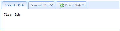
The tabs display a collection of panel. It shows only one tab panel at a time. Each tab panel has the header title and some mini button tools, including close button and other customized buttons.
Dependencies
- panel
- linkbutton
Usage Example
Create tabs
1. Create tabs via markup
Create tabs from markup is even easier, we don't need to write any JavaScript code. Remember to add 'easyui-tabs' class to <div> markup. Each tab panel is created via sub <div> markup, the usage is same as panel.
2. Create tabs programatically
Now we create tabs programatically, we catch the 'onSelect' event also.
Add new tab panel
Add a new tab panel with mini tools, the mini tools icon(8x8) is placed before the close button.
Get the selected Tab
Properties
| Name | Type | Description | Default |
|---|---|---|---|
| width | number | The width of tabs container. | auto |
| height | number | The height of tabs container. | auto |
| plain | boolean | True to render the tab strip without a background container image. | false |
| fit | boolean | True to set the size of tabs container to fit it's parent container. | false |
| border | boolean | True to show tabs container border. | true |
| scrollIncrement | number | The number of pixels to scroll each time a tab scroll button is pressed. | 100 |
| scrollDuration | number | The number of milliseconds that each scroll animation should last. | 400 |
| tools | array,selector |
The toolbar placed on left or right side of header. Possible values: 1. An array indicate the tools, each tool options is same as linkbutton. 2. A selector point to the <div> that contains the tools. Code example: Define tools with an array.
$('#tt').tabs({
	tools:[{
		iconCls:'icon-add',
		handler:function(){
			alert('add')
		}
	},{
		iconCls:'icon-save',
		handler:function(){
			alert('save')
		}
	}]
});
Define tools with an existing DOM container.
$('#tt').tabs({
	tools:'#tab-tools'
});
<div id="tab-tools">
	<a href="#" class="easyui-linkbutton" plain="true" iconCls="icon-add"></a>
	<a href="#" class="easyui-linkbutton" plain="true" iconCls="icon-save"></a>
</div>
|
null |
| toolPosition | string | The toolbar position. Possible values: 'left','right','top','bottom'. Available since version 1.3.2. | right |
| tabPosition | string | The tab position. Possible values: 'top','bottom','left','right'. Available since version 1.3.2. | top |
| headerWidth | number | The tab header width, it is valid only when tabPosition is set to 'left' or 'right'. Available since version 1.3.2. | 150 |
| tabWidth | number | The width of tab strip. Available since version 1.3.4. | auto |
| tabHeight | number | The height of tab strip. Available since version 1.3.4. | 27 |
| selected | number | The initialized selected tab index. Available since version 1.3.5. | 0 |
| showHeader | boolean | True to display tabs header. Available since version 1.3.5. | true |
| justified | boolean | True to make tab strips equal widths of their parent container. Available since version 1.4.2. | false |
| narrow | boolean | True to remove the space between tab strips. Available since version 1.4.2. | false |
| pill | boolean | True to make tab strips look like pills. Available since version 1.4.2. | false |
Events
| Name | Parameters | Description |
|---|---|---|
| onLoad | panel | Fires when an ajax tab panel finish loading remote data. |
| onSelect | title,index | Fires when user select a tab panel. |
| onUnselect | title,index | Fires when user unselect a tab panel. Available since version 1.3.5. |
| onBeforeClose | title,index |
Fires before the tab panel is closed, return false to cancel this close action.
The example below shows how to show confirm dialog before closing tab panel.
$('#tt').tabs({
  onBeforeClose: function(title){
	return confirm('Are you sure you want to close ' + title);
  }
});
// using the async confirm dialog
$('#tt').tabs({
  onBeforeClose: function(title,index){
	var target = this;
	$.messager.confirm('Confirm','Are you sure you want to close '+title,function(r){
		if (r){
			var opts = $(target).tabs('options');
			var bc = opts.onBeforeClose;
			opts.onBeforeClose = function(){};  // allowed to close now
			$(target).tabs('close',index);
			opts.onBeforeClose = bc;  // restore the event function
		}
	});
	return false;	// prevent from closing
  }
});
|
| onClose | title,index | Fires when user close a tab panel. |
| onAdd | title,index | Fires when a new tab panel is added. |
| onUpdate | title,index | Fires when a tab panel is updated. |
| onContextMenu | e, title,index | Fires when a tab panel is right clicked. |
Methods
| Name | Parameter | Description |
|---|---|---|
| options | none | Return the tabs options. |
| tabs | none | Return all tab panels. |
| resize | none | Resize the tabs container and do layout. |
| add | options |
Add a new tab panel, the options parameter is a config object, see tab panel properties for more details.
When adding a new tab panel, it will become selected. To add a unselected tab panel, remember to set 'selected' property to false.
// add a unselected tab panel
$('#tt').tabs('add',{
	title: 'new tab',
	selected: false
	//...
});
// insert a tab panel to the index 2
$('#tt').tabs('add',{
	title: 'inserted tab',
	index: 2
})
|
| close | which | Close a tab panel, the 'which' parameter can be the title or index of tab panel to be closed. |
| getTab | which | Get the specified tab panel, the 'which' parameter can be the title or index of tab panel. |
| getTabIndex | tab | Get the specified tab panel index |
| getSelected | none |
Get the selected tab panel. The example below shows how to get the index of selected tab panel.
var tab = $('#tt').tabs('getSelected');
var index = $('#tt').tabs('getTabIndex',tab);
alert(index);
|
| select | which | Select a tab panel, the 'which' parameter can be the title or index of tab panel. |
| unselect | which | Select a tab panel, the 'which' parameter can be the title or index of tab panel. Available since version 1.3.5. |
| showHeader | none | Show the tabs header. Available since version 1.3.5. |
| hideHeader | none | Hide the tabs header. Available since version 1.3.5. |
| showTool | none | Show the tabs tools. Available since version 1.4.3. |
| hideTool | none | Hide the tabs tools. Available since version 1.4.3. |
| exists | which | Indicate if the special panel is exists, the 'which' parameter can be the title or index of tab panel. |
| update | param |
Update the specified tab panel, the param parameter contains two properties: tab: the tab panel to be updated. type: the updating type, available values are: 'header','body','all'. options: the panel options. Code example:
// update the selected panel with new title and content
var tab = $('#tt').tabs('getSelected');  // get selected panel
$('#tt').tabs('update', {
	tab: tab,
	options: {
		title: 'New Title',
		href: 'get_content.php'  // the new content URL
	}
});
// call 'refresh' method for tab panel to update its content
var tab = $('#tt').tabs('getSelected');  // get selected panel
tab.panel('refresh', 'get_content.php');
|
| enableTab | which |
Enable the specified tab panel, the 'which' parameter can be the title or index of tab panel.
Available since version 1.3.
Code example:
$('#tt').tabs('enableTab', 1);	// enable the second tab panel
$('#tt').tabs('enableTab', 'Tab2');	enable the tab panel that has 'Tab2' title
|
| disableTab | which |
Disable the specified tab panel, the 'which' parameter can be the title or index of tab panel.
Available since version 1.3.
Code example:
$('#tt').tabs('disableTab', 1); // disable the second tab panel.
|
| scrollBy | deltaX |
Scroll the tab header by the specified amount of pixels,
negative values scroll to the right, positive values scroll to the left.
Available since version 1.3.2.
Code example:
// scroll the tab header to left
$('#tt').tabs('scroll', 10);
|
Tab Panel
The tab panel properties is defined in panel component, below is some common properties.
| Name | Type | Description | Default |
|---|---|---|---|
| id | string | The id attribute of tab panel. | null |
| title | string | The tab panel title text. | |
| content | string | The tab panel content. | |
| href | string | A URL to load remote content to fill the tab panel. | null |
| cache | boolean | True to cache the tab panel, valid when href property is setted. | true |
| iconCls | string | An icon CSS class to show on tab panel title. | null |
| width | number | The width of tab panel. | auto |
| height | number | The height of tab panel. | auto |
| collapsible | boolean | True to allow tab panel to be collapsed. | false |
Some added properties.
| Name | Type | Description | Default |
|---|---|---|---|
| closable | boolean | When set to true, the tab panel will show a closable button which can be clicked to close the tab panel. | false |
| selected | boolean | When set to true, the tab panel will be selected. | false |
| disabled | boolean | When set to true, the tab panel will be disabled. | false |