TextBox
Extend from $.fn.validatebox.defaults. Override defaults with $.fn.textbox.defaults.
The TextBox component is a enhanced input field that allows users build their form easily. It is the base component for building other complex components such as combo,datebox,spinner,etc.
Dependencies
- validatebox
- linkbutton
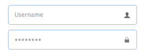
Usage Example
Create textbox from markup.
Create textbox by using javascript.
Properties
The properties extend from validatebox, below is the added properties for textbox:
| Name | Type | Description | Default |
|---|---|---|---|
| width | number | The width of the component. | auto |
| height | number | The height of the component. | auto |
| cls | string | Add a CSS class to the textbox. Available since version 1.5.1. | |
| prompt | string | The prompt message to be displayed in input box. | '' |
| value | string | The default value. | |
| type | string | The textbox type. Possible values are 'text' and 'password'. | text |
| label | string,selector |
The label bound to textbox. Available since version 1.5.
Code example:
$('#t1').textbox({
	width: 300,
	label: 'Name:'
});
$('#t2').textbox({
	width: 300,
	label: $('#label2')
});
|
null |
| labelWidth | number | The label width. Available since version 1.5. | auto |
| labelPosition | string | The label position. Possible values are:'before','after','top'. Available since version 1.5. | before |
| labelAlign | string | The label alignment. Possible values are:'left','right'. Available since version 1.5. | left |
| multiline | boolean | Defines if this is a multiline textbox. | false |
| editable | boolean | Defines if the user can type text directly into the field. | true |
| disabled | boolean | Defines if to disable the field. | false |
| readonly | boolean | Defines if the component is read-only. | false |
| icons | array |
The icons attached to the textbox. Each item has the following properties: iconCls: string, the icon class. disabled: boolean, indicate if the icon is disabled. handler: function, the function to process the clicking action on this icon. Code example:
$('#tb').textbox({
	icons: [{
		iconCls:'icon-add',
		handler: function(e){
			$(e.data.target).textbox('setValue', 'Something added!');
		}
	},{
		iconCls:'icon-remove',
		handler: function(e){
			$(e.data.target).textbox('clear');
		}
	}]
})
|
[] |
| iconCls | string | The background icon displayed on the textbox. | null |
| iconAlign | string | Position of the icons. Possible values are 'left','right'. | right |
| iconWidth | number | The icon width. | 18 |
| buttonText | string | The displaying text of button that attached to the textbox. | |
| buttonIcon | string | The displaying icon of button that attached to the textbox. | null |
| buttonAlign | string | Position of the button. Possible values are 'left','right'. | right |
Events
The events extend from validatebox, below is the added events for textbox.
| Name | Parameters | Description |
|---|---|---|
| onChange | newValue,oldValue | Fires when the field value is changed. |
| onResize | width,height | Fires when the textbox is resized. |
| onClickButton | none | Fires when the user click the button. |
| onClickIcon | index | Fires when the user click a icon. |
Methods
The methods extend from validatebox, below is the added methods for textbox.
| Name | Parameter | Description |
|---|---|---|
| options | none | Return the options object. |
| textbox | none |
Return the textbox object. The user can bind any events to this editing box.
Code example:
var t = $('#tt');
t.textbox('textbox').bind('keydown', function(e){
	if (e.keyCode == 13){	// when press ENTER key, accept the inputed value.
		t.textbox('setValue', $(this).val());
	}
});
|
| button | none | Return the button object. |
| destroy | none | Destroy the textbox component. |
| resize | width | Resize the component width. |
| disable | none | Disable the component. |
| enable | none | Enable the component. |
| readonly | mode |
Enable/Disable readonly mode.
Code example:
$('#tb').textbox('readonly');	// enable readonly mode
$('#tb').textbox('readonly',true);	// enable readonly mode
$('#tb').textbox('readonly',false);	// disable readonly mode
|
| setEditable | mode |
Set the editable mode for the textbox component.
Code example:
$('#tb').textbox('setEditable');		// set editable to true
$('#tb').textbox('setEditable',true);	// set editable to true
$('#tb').textbox('setEditable',false);	// set editable to false
|
| clear | none | Clear the component value. |
| reset | none | Reset the component value. |
| initValue | value | Initialize the component value. Calling this method does not trigger the 'onChange' event. |
| setText | text | Set the displaying text value. |
| getText | none | Get the displaying text value. |
| setValue | value | Set the component value. |
| getValue | none | Get the component value. |
| getIcon | index | Get specified icon object. |