ValidateBox
Override defaults with $.fn.validatebox.defaults.
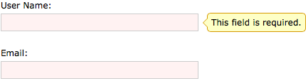
The validatebox is designed to validate the form input fields. If users enter invalid values, it will change the background color, display the alarm icon and a tooltip message. The validatebox can be integrated with form plugin and will prevent invalid fields from submission.
Dependencies
- tooltip
Usage
Create validatebox from markup.
Create validatebox using javascript.
To check password and retype password are same.
Validate Rule
The validate rule is defined by using required and validType property, here are the rules already implemented:
- email: Match email regex rule.
- url: Match URL regex rule.
- length[0,100]: Between x and x characters allowed.
- remote['http://.../action.do','paramName']: Send ajax request to do validate value, return 'true' when successfully.
To custom validate rule, override $.fn.validatebox.defaults.rules that defines a validator function and invalid message. For example, to define a minLength valid type:
Now you can use the minLength validtype to define an input box that should be inputed at least 5 characters:
Properties
| Name | Type | Description | Default |
|---|---|---|---|
| required | boolean | Defines whether the field should be inputed. | false |
| validType | string,array |
Defines the field valid type, such as email, url, etc. Possible values are: 1) a valid type string, apply a single validate rule. 2) a valid type array, apply multiple validate rules. The multiple validate rules on a field are available since version 1.3.2. 3) a key/value pairs, the key is the validing type name, the value is an array consisting validating parameters. Code example:
<input class="easyui-validatebox" data-options="required:true,validType:'url'">
<input class="easyui-validatebox" data-options="
	required:true,
	validType:['email','length[0,20]']
">
<input class="easyui-validatebox" data-options="
	required:true,
	validType:{
		length:[10,30],
		remote:['http://.../action.do','paramName']
	}
">
|
null |
| delay | number | Delay to validate from the last inputting value. Available since version 1.3.2. | 200 |
| missingMessage | string | Tooltip text that appears when the text box is empty. | This field is required. |
| invalidMessage | string | Tooltip text that appears when the content of text box is invalid. | null |
| tipPosition | string | Defines the position of tip message when the content of text box is invalid. Possible values: 'left','right','top','bottom'. Available since version 1.3.2. | right |
| deltaX | number | Tooltip offset in the X direction. Available since version 1.3.3. | 0 |
| novalidate | boolean | Defines whether to turn off validation. Available since version 1.3.4. | false |
| editable | boolean | Defines whether the user can type text directly into the field. Available since version 1.4.5. | true |
| disabled | boolean | Defines whether to disable the validatebox. Available since version 1.4.5. | false |
| readonly | boolean | Defines whether the component is read-only. Available since version 1.4.5. | false |
| validateOnCreate | boolean | Defines whether to validate after creating the component. Available since version 1.4.5. | true |
| validateOnBlur | boolean | Defines whether to validate when losing focus. Available since version 1.4.5. | false |
Events
| Name | Parameters | Description |
|---|---|---|
| onBeforeValidate | none | Fires before validate on a field. Available since version 1.4. |
| onValidate | valid | Fires when validate on a field. Available since version 1.4. |
Methods
| Name | Parameter | Description |
|---|---|---|
| options | none | Return the options object. |
| destroy | none | Remove and destroy the component. |
| validate | none | Do the validation to determine whether the content of text box is valid. |
| isValid | none | Call validate method and return the validation result, true or false. |
| enableValidation | none | Enable validation. Available since version 1.3.4. |
| disableValidation | none | Disable validation. Available since version 1.3.4. |
| resetValidation | none | Reset validation. Available since version 1.4.5. |
| enable | none | Enable the component. Available since version 1.4.5. |
| disable | none | Disable the component. Available since version 1.4.5. |
| readonly | mode |
Enable/Disable readonly mode. Available since version 1.4.5.
Code example:
$('#tt').validatebox('readonly');		// enable readonly mode
$('#tt').validatebox('readonly',true);	// enable readonly mode
$('#tt').validatebox('readonly',false);	// disable readonly mode
|